Memphis Group (1981-1987): when Ettore Sottsass dynamited the codes of modern design
Memphis is not simply a style: it’s an ideological revolution that frontally rejects functionalist austerity, industrial rationalism, and the cult of “good design” that had dominated since the postwar period. Where modernism preached “less is more,” Memphis shouts “more is more.” Where Good Design promised universal and timeless objects, Memphis creates deliberately ephemeral, local, ironic pieces. This heterogeneous collective – Italians, British, Austrians, French, Japanese – transforms design into an experimental playground, reintroducing humor, color, and fantasy into a field that had become too serious.
Genesis of a Rebellion: The Origins of the Memphis Group
Ettore Sottsass: The Rebel Patriarch
To understand Memphis, one must first grasp the singular trajectory of its founder, Ettore Sottsass (1917-2007). An architect by training and design consultant for Olivetti since 1958, Sottsass could have settled for a comfortable career as a respected industrial designer. His Valentine (1969) and Praxis typewriters already embodied a playful and colorful approach that contrasted with dominant corporate austerity. But at the turn of the 1970s, Sottsass underwent a profound creative and existential crisis.

His travels to India in the 1960s, his encounter with Californian counterculture, and his involvement in the Italian Radical Design movement with groups like Archizoom and Superstudio transformed his vision of design. He gradually rejected the modernist ideal of the perfect, rational, universal object. In his writings and interviews from the 1970s, Sottsass theorized a more emotional, personal, narrative design: “Objects should not only function, they must tell stories, evoke emotions, create atmospheres.”
In 1980, Sottsass was 63 years old. Rather than gradually retiring, he decided to radicalize his approach. Surrounded by a new generation of designers he had met through his teaching and collaborations – Michele De Lucchi, Matteo Thun, Aldo Cibic, Marco Zanini – he founded an informal structure, without strict hierarchy, where everyone could experiment freely. The name “Memphis” was born during an evening where Bob Dylan’s Stuck Inside of Mobile with the Memphis Blues Again played on loop, simultaneously evoking the capital of American blues, ancient Egypt, and a certain pop nostalgia.
The Milanese Context: Postmodernism and Modernist Disillusionment
Milan at the turn of the 1980s constituted the fertile ground for this rebellion. The Lombard capital, epicenter of Italian design since the postwar period, was going through a period of intense questioning. The Italian economic miracle was running out of steam, the political violence of the “years of lead” left deep scars, and culturally, the consensus around modernist functionalism was cracking. The postmodern movement, theorized in architecture by figures like Robert Venturi (Learning from Las Vegas, 1972) or Charles Jencks, contested modernist orthodoxy by rehabilitating ornament, color, history, and irony.
Italian pioneer groups like Alchimia, founded in 1976 by Alessandro Guerriero and in which Sottsass actively participated, were already experimenting with expressive, colorful, anti-functionalist forms. Alchimia’s “Bau.Haus” collections (1979) ironically subverted Bauhaus canons by saturating them with colors and decorations. But Alchimia remained conceptual, producing very limited series for sophisticated collectors. Sottsass and his companions wanted to go further: create objects that, while remaining provocative and experimental, could potentially enter contemporary interiors.
The broader cultural context was also crucial. The emergence of punk in Great Britain, new wave in music, neo-expressionists in painting (Basquiat, Haring), all shared with Memphis a rejection of established conventions, an aesthetic of bricolage and collage, a celebration of the impure and hybrid. The first video game consoles (Pac-Man, 1980) and the advent of MTV (1981) established a saturated, nervous, fragmented visual culture that resonated with Memphis’s formal intuitions.
The Founding Evening: Legend and Reality
Memphis mythology officially begins on December 11, 1980, during a dinner at Sottsass’s home in Milan. Around the table: Barbara Radice (journalist and future partner of Sottsass, who would become the group’s theorist and spokesperson), Matteo Thun, Aldo Cibic, Michele De Lucchi, Marco Zanini. The conversation centered on the necessity of creating a “new design,” freed from modernist dogmas. Dylan’s record played, the discussion heated up, and someone proposed: “Why not create a collection together?”
The idea quickly materialized. Everyone left with the mission to design a few pieces – furniture, lighting, objects – according to their own intuitions, without constraining brief, without functionalist specifications. The only rule: dare, experiment, have fun. Sottsass also contacted international designers he admired: British George J. Sowden, Austrian Michael Graves, Japanese Masanori Umeda, French Martine Bedin, Spanish Javier Mariscal. This international dimension was fundamental: Memphis would not be an Italian movement but a cosmopolitan laboratory.
In a few months, prototypes accumulated in Sottsass’s workshop. They were often handcrafted, with modest materials: laminate printed with cheap decorative patterns, chromed metal tubes, plywood, molded plastic. The “handmade” aspect was assumed: Memphis rejected industrial perfection in favor of an aesthetic of skilled bricolage. Funding came from Ernesto Gismondi, boss of Artemide, who agreed to produce these improbable objects in small series, a bold bet for an industrialist accustomed to the commercial successes of Tolomeo or Tizio lamps.
The First Collection: Visual Manifesto and Controlled Scandal
September 1981: The Aesthetic Shock
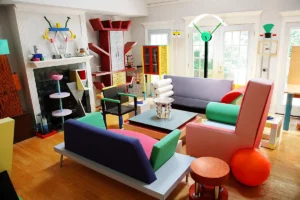
The first Memphis exhibition opened on September 18, 1981 at the Arc ’74 showroom, via Manzoni in Milan, on the sidelines of the Furniture Fair. The impact was lightning. Visitors discovered about fifty pieces that seemed to come from a parallel dimension: the “Carlton” bookcase by Sottsass, an asymmetrical structure in colored laminate simultaneously evoking a totem, a miniature skyscraper, and a giant toy; the “Proust” armchair by Alessandro Mendini (presented as a guest), covered with a pointillist pattern inspired by Seurat’s divisionism; the “Tahiti” lamp by Sottsass, two superimposed enamel spheres on a chromed tubular base with disturbing visual instability.
The colors assaulted the eye: lemon yellow, fuchsia pink, electric turquoise, apple green, associated in violent contrasts that traditional good taste formally proscribed. The patterns – bacterial, geometric, kitsch florals, pop stripes – covered surfaces in printed laminate, creating deliberately excessive decorative saturation. The forms defied balance: bizarre angles, hazardous superimpositions, deconstructed geometries that seemed to ignore the laws of statics and ergonomics.
The reaction was binary: absolute fascination or visceral rejection. Purists of modern design cried scandal, denouncing a regression toward petit-bourgeois bad taste, a betrayal of modernist ideals. Domus, the architecture magazine directed by Mendini (himself close to Memphis), headlined “Memphis: the new international design.” Karl Lagerfeld immediately bought several pieces for his apartment. David Bowie visited the exhibition incognito. Fashion photographers rushed to use these delirious furniture as sets for their shoots.
Iconic Pieces: Formal Decoding
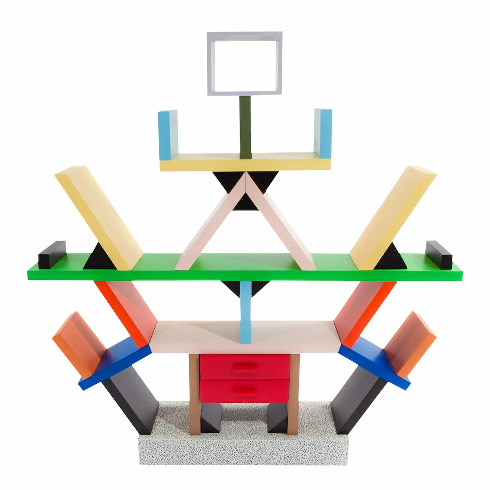
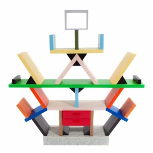
The “Carlton” Bookcase
The “Carlton” bookcase (Ettore Sottsass, 1981) instantly became the absolute icon of Memphis. Standing 196 cm tall, this asymmetrical shelf in wood and laminate declined an elementary geometric vocabulary – rectangles, triangles, circles – assembled according to apparently random but actually carefully orchestrated logic. The colors (red, yellow, blue, green, black) dialogue according to tension relationships rather than harmony. Carlton is not really functional – some shelves are difficult to access, the structure seems precarious – but that’s precisely the point: Memphis questions functionalist obsession to propose inhabitable object-sculptures.
The “Tahiti” Floor Lamp (Ettore Sottsass, 1981)
Ettore Sottsass’s “Tahiti” floor lamp embodies Memphis’s poetics of unstable balance. Two enameled spheres – one white with black dots, the other red – are perched on a long inclined chrome tube, creating a composition that seems to defy gravity. This visual precariousness generates dramatic tension: the object appears about to topple over, maintained by a miracle of discreet engineering. Tahiti simultaneously evokes a stylized palm tree, an orbiting planet, a childish construction, multiplying references without fixing on any.

The “Plaza” Console, Michael Graves, 1981
The “Plaza” console illustrates the American architect’s postmodern approach: miniature columns supporting a top, references to classical architecture diverted into pop materials (laminate, chrome metal), sophisticated pastel palette. The “Super” lamp (Martine Bedin, 1981), a small wheeled structure in colored metal equipped with bare bulbs, evokes an electronic toy or domestic robot, introducing a playful and mobile dimension into lighting.

Memphis Materials: Laminate as Manifesto
The choice of materials in Memphis is never incidental. Decorative laminate (Abet Laminati, Abet Print) becomes the movement’s signature material, precisely because it embodies everything modernism despises: assumed artifice, crude imitation (fake wood, fake marble), surface rather than structure, applied decoration rather than integrated ornament. Memphis transforms this popular and economical material into an expressive medium, even commissioning exclusive patterns from Abet Laminati: stylized bacteria, psychedelic terrazzo, tribal geometries.
Chrome metal – tubes, spheres, tubular structures – brings an ironic high-tech touch, simultaneously evoking the aesthetic of American vending machines and medical furniture. Molded plastics in saturated colors (often produced by Kartell) celebrate pop culture and the petrochemical industry. Glass, sometimes blown in Murano in exuberant organic forms, reintroduces Venetian craftsmanship into contemporary design.
This deliberately heterogeneous and anti-hierarchical material palette – noble materials (Murano glass, marble) alongside humble materials (plywood, cheap laminate) – constitutes a manifesto in itself: Memphis refuses the modernist distinction between “honest” and “vulgar” materials. All deserve to be explored for their expressive qualities rather than judged according to a moral value scale.
The Memphis Visual Universe: Codes and References
Color and Chromatic Saturation
The Memphis palette perhaps constitutes its most immediately recognizable and most radical element. Where modernism favored non-colors (white, black, gray) possibly enhanced with a touch of pure primary color, Memphis deploys an explosive chromatic range: shocking pink, swimming pool turquoise, canary yellow, mandarin orange, apple green, aubergine purple, often juxtaposed in combinations that good taste codes formally proscribe.
This chromatic approach draws from several sources: the saturated colors of pop art (Warhol, Lichtenstein), the acidic tones of new media (video games, nascent MTV clips), the frank pigments of Mediterranean crafts (Sicilian ceramics, Mexican textiles), and paradoxically the synthetic palettes of modern chemical industry. Memphis reconciles high and low culture, scholarly references and trivial inspirations in a chromatic synthesis joyfully indifferent to established cultural hierarchies.
Color use in Memphis is never decorative in the traditional sense: it is structural and narrative. Colored flat tints delimit functional zones, create visual rhythms, generate tensions or harmonies. The juxtaposition of complementary colors (orange and blue, red and green) creates an optical vibration that animates surfaces, transforming static furniture into visually dynamic objects.
Patterns and Decorations: The Return of Ornament
By rehabilitating decorative pattern, Memphis commits a crime of lèse-majesté against modernism. Since Adolf Loos and his incendiary essay Ornament and Crime (1908), then the Bauhaus and Le Corbusier, modern design had progressively evacuated all applied ornament, considered superfluous, mendacious, petit-bourgeois. Memphis not only reintroduces pattern but multiplies, saturates, and complexifies it to assumed excess.
Memphis patterns constitute a heterogeneous catalog: stylized bacteria evoking microorganisms seen under a microscope, psychedelic terrazzo reinterpreting traditional Venetian flooring, tribal geometries inspired by African or Oceanic art, pop art stripes and dots, grids and checkerboards, kitsch florals, gestural stains and splashes. This diversity refuses any univocal stylistic coherence: Memphis juxtaposes rather than unifies, creating visual collages where scholarly and trivial references coexist without hierarchy.
Pattern in Memphis illustrates nothing, represents nothing: it is pure visual presence, optical texture that activates the surface. Memphis designers commissioned exclusive patterns from laminate manufacturers, creating a pattern library that became as iconic as the forms themselves. These printed surfaces transform furniture into three-dimensional graphic objects, blurring the boundary between object design and graphic design.
Forms and Compositions: Deconstructed Geometry
On the formal level, Memphis develops a language of deconstructed elementary geometry. Designers use primary forms – cube, sphere, cylinder, cone, pyramid – but assemble them according to apparently absurd logics: radical asymmetries, bizarre inclinations, improbable superimpositions, deformed proportions. This approach simultaneously evokes Russian constructivism (Malevich, El Lissitzky), De Stijl neoplasticism, but diverted by a pop and ironic sensibility.
Asymmetry becomes a central compositional principle: where classical design seeks balance and symmetry, Memphis favors controlled imbalance, visual tension, apparent instability. Bookcases climb in staircase fashion, lamps lean dangerously, tables present inclined tops. This formal precariousness creates visual dramaturgy: objects seem in movement, frozen in an instant of unstable balance.
Modularity and assembly also constitute recurring formal strategies. Memphis furniture often resembles childish constructions, stacks of geometric volumes held by mysterious logic. This aesthetic of skilled bricolage, which recalls the approach of organic design but in a geometric rather than biomorphic register, values visible assembly over homogeneous fusion, collage over synthesis.
The Memphis Collective: Creator Portraits
Michele De Lucchi: The Architect-Poet
Michele De Lucchi (born 1951) embodies the generation that immediately succeeds Sottsass. An architect by training, involved in the Radical Design movement with the Cavart group, De Lucchi brings to Memphis a more architectural sensibility and a fascination for domestic archetypes. His Memphis creations – “Kristall” lamp (1981) evoking a miniature temple, “Oceanic” bookcase (1982) structured like a building – reinterpret classical architectural typologies (columns, pediments, roofs) in Memphis pop language.
De Lucchi practices what he calls “archetypal design”: starting from elementary forms of the house, temple, lamp as a child would draw them, then sophisticating them through color, material, detail. This approach introduces into Memphis a more narrative and symbolic dimension: his objects tell stories, evoke imaginary places, create inhabitable mini-architectures. After Memphis, De Lucchi would pursue a remarkable career as architect and designer, notably signing the first Mandarina Duck boutiques and working for Olivetti, Artemide, Kartell.
Martine Bedin: French Energy
Frenchwoman Martine Bedin (born 1957) is the only female designer in the Memphis hardcore – Barbara Radice playing more a role of theorist and communicator. Trained at the École des Beaux-Arts in Bordeaux then in Architecture in Florence, Bedin arrived in Milan in 1978, worked in Sottsass’s studio and participated in Memphis from its foundation. Her major contribution, the “Super” lamp (1981), perfectly embodies the Memphis spirit: a small wheeled structure in yellow lacquered metal equipped with four bare bulbs and casters, it evokes a toy, a domestic robot, a mobile luminous companion.

“Super” introduces into lighting design a playful and interactive dimension: the object is no longer fixed to the wall or statically placed but moves, accompanies the user, transforms lighting into a game. This approach prefigures contemporary questions about nomadic and connected objects. Bedin also creates textiles, vases, watches for Memphis, exploring different mediums with total freedom. After Memphis, she pursues an independent designer career, notably working on urban furniture and public spaces.
George Sowden and Nathalie du Pasquier: The Chromatic Duo
British George J. Sowden (born 1942) and French Nathalie du Pasquier (born 1957) form a creative duo central to Memphis visual identity. Sowden, an industrial designer trained at the Royal College of Art in London, has worked in Olivetti’s studio in Milan since the 1970s. He brings to Memphis technical mastery of electronic products – he designs clocks, radios, televisions for Memphis – and a keen sense of geometric pattern. His surfaces decorated with grids, checkerboards, stripes create sophisticated optical vibrations.
Nathalie du Pasquier, who arrived in Milan in 1979, initially concentrated on textile design and pattern creation for Memphis laminates. Her compositions – mixtures of geometric forms, organic stains, tribal references – become the graphic signature of the movement. Du Pasquier also creates jewelry, carpets, objects that explore the possibilities of applied pattern. Her essential contribution lies in this ability to generate coherent visual identity through diversity: du Pasquier’s patterns visually unify Memphis production despite the multiplicity of designers.
Sowden and du Pasquier founded the Rainbow brand together in 1982, which produces colored plastic objects (trays, containers) extending Memphis aesthetics into more accessible products. Du Pasquier would leave design in the 1990s to devote herself to painting, creating abstract works that extend her research on color and form. Sowden would pursue a designer career, notably creating the small appliance brand HAY.
Diffusion and Reception: Memphis Conquers the World
Successive Collections: Evolution and Radicalization
Between 1981 and 1988, Memphis produced seven annual collections, presented each September during the Milan Furniture Fair. Each edition explored new directions while deepening the established vocabulary. The 1982 collection introduced new designers (Hans Hollein, Arata Isozaki) and explored unprecedented typologies (garden furniture, tableware). The 1983 collection radicalized the chromatic approach with even more saturated pieces. The 1984 collection integrated more references to traditional crafts (ceramics, textiles).
Over the years, a certain professionalization occurred: artisanal prototypes of the early days gave way to technically more accomplished productions, editions became larger (although remaining limited), distribution was organized internationally. Paradoxically, this relative commercial success – Memphis was never profitable but found its audience – perhaps diluted the subversive energy of the origins. The 1986-1987 collections sometimes seemed to repeat established formulas rather than radically renewing them.
The last official collection was presented in 1988. Sottsass then announced the group’s dissolution: “Memphis has accomplished its mission. There is no point in continuing to repeat the same formulas. We have opened doors, others can now cross them.” This programmed, assumed end is part of Memphis coherence: a movement born in the ephemeral and experimental, it refuses to fossilize into academic style. Better to disappear at the top than decline progressively.
Critical Reception: Between Scandal and Consecration
Critical reception of Memphis oscillated between horrified rejection and admiring fascination. The guardians of the modernist temple – architects and designers trained in the rationalist tradition – denounced a regression toward bad taste, a betrayal of functionalist ideals, commercial cynicism disguised as experimentation. In Domus and Abitare, debates raged: was Memphis the future of design or its gravedigger?
Memphis defenders – foremost among them Barbara Radice, who published in 1984 the founding book Memphis: Research, Experiences, Results, Failures and Successes of New Design – argued that the movement liberated design from its ideological shackles. Memphis did not propose a new dogma but a methodological opening: the legitimacy of emotion over reason alone, pleasure over function, stylistic diversity over modernist uniformity. This defense inscribed itself in the broader postmodern debate that then crossed architecture, art, and cultural theory.
Mainstream media adopted Memphis enthusiastically. Fashion magazines used Memphis furniture as spectacular shoot sets: the bright colors and eccentric forms created perfect visual atmospheres for fashion photography. Vogue, Elle, Harper’s Bazaar multiplied Memphis editorials. Nascent MTV video clips integrated Memphis aesthetics into their sets. This massive media coverage quickly transformed Memphis into a cultural phenomenon far exceeding the restricted circle of avant-garde design.
Collectors and Prescribers: From Design to Artwork Status
From the first collections, Memphis attracted an unexpected clientele of collectors from the art, fashion, and entertainment worlds. Karl Lagerfeld immediately acquired several major pieces for his Parisian apartment and even commissioned custom creations. David Bowie collected Memphis, as did Grace Jones who integrated the movement’s aesthetic into her stage image. These cultural prescribers conferred on Memphis a glamorous legitimacy that amplified its influence.
Major international museums quickly acquired Memphis pieces for their permanent collections: the Metropolitan Museum of Art in New York, the Victoria & Albert Museum in London, the Vitra Design Museum in Germany, the Musée des Arts Décoratifs in Paris. This institutional recognition transformed Memphis objects into artworks in their own right, worthy of being preserved and studied. Prices on the art market climbed spectacularly: a Carlton bookcase can today sell for more than 500,000 euros at auction.
This rapid patrimonialization creates a fascinating paradox: Memphis, a movement born in rejection of academic seriousness and celebration of the ephemeral, becomes an object of museum veneration and speculative investment. Pieces designed partly with “poor” materials (laminate, plywood) acquire considerable economic and symbolic value. Memphis thus partially escapes its creators to become historical heritage and cultural capital.
International Influence and Cultural Variations
Memphis and Fashion: A Reciprocal Influence
Memphis’s influence on 1980s fashion is spectacular and reciprocal. Fashion designers instantly adopted Memphis chromatic and graphic codes: Jean-Paul Gaultier integrated stripes, geometric patterns, and saturated colors directly inspired by the movement into his collections. Gianni Versace developed a maximalist aesthetic where baroque patterns and postmodern geometries dialogue in a very Memphis spirit. Thierry Mugler sculpted architectural silhouettes in frank colors that evoke Sottsass’s compositions. Memphis influence is also felt in the latest trends in the confidential world of luxury and high-end decoration.
Accessories – jewelry, bags, shoes – declined Memphis aesthetics into wearable objects. Designers like Patrick Kelly or Stephen Sprouse created pieces where primary colors and pop patterns celebrate a playful and assertive femininity. Sunglasses with colored geometric frames, Swatch watches with graphic dials (some models directly designed by Memphis designers like Sowden), costume jewelry in colored plastic democratized Memphis aesthetics to a young audience.
This permeability between fashion and design is explained by a common sensibility: celebration of surface and appearance, rejection of austere functionalism in favor of visual pleasure, legitimization of the ephemeral and seasonal. Memphis and 1980s fashion also share an approach to body and space as supports for identity expression rather than neutral data to be rationally equipped.
Graphic Design and Pop Visual Culture
Memphis’s impact on 1980s graphic design was considerable. The movement’s visual codes—colorful primary geometries, saturated patterns, asymmetric compositions, bold typography—irrigated an entire decade’s visual identity. Album covers (particularly new wave and synthpop), concert posters, youth brand identities massively adopted this aesthetic.
The launch of MTV in August 1981—just weeks before the first Memphis collection—created perfect convergence. Music videos, a new medium exploring its language, immediately adopted Memphis’s characteristic saturated colors, pop geometries, and collage aesthetic. MTV’s graphics, with their animated logos, explosive graphic transitions, and acidic palettes, extended Memphis into televisual space. This circularity—Memphis influencing MTV which in turn popularized Memphis aesthetic—exponentially amplified the movement’s diffusion.
Video games in full commercial explosion (Atari consoles, Nintendo, first color arcade machines) also shared with Memphis an aesthetic of geometric pixelization and saturated primary colors. The graphic interfaces of early personal computers (Apple Macintosh, Commodore Amiga) adopted colorful palettes and geometric icons owing much to Memphis’s visual vocabulary. This infiltration into nascent digital culture ensured Memphis an unexpected posterity in contemporary digital aesthetics.
Postmodern Architecture and Dialogue Between Disciplines
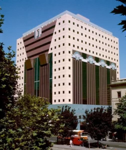
Though Memphis was primarily an object design movement, its influence on postmodern architecture was real if less direct. Architects like Michael Graves (who designed several Memphis pieces), Hans Hollein, Arata Isozaki shared with Memphis an approach rehabilitating color, ornament, and diverted historical reference. 1980s postmodern buildings—with their colored pediments, stylized columns, chromatic interplay—dialogued with Memphis in monumental register.
Michael Graves’s Portland Building (1982), with its polychrome façades and applied geometric patterns, or Charles Moore’s Piazza d’Italia in New Orleans (1978), with its kitsch columns and colored neons, embodied Memphis-adjacent sensibility transposed to urban scale. This convergence wasn’t fortuitous: it testified to a broader cultural movement questioning modernism that simultaneously traversed all design and architecture disciplines, as also evidenced by the emergence of new architectural approaches seeking to reintegrate sensoriality and expressivity.
In interior architecture, Memphis profoundly influenced 1980s commercial space design: fashion boutiques, trendy restaurants, nightclubs, showrooms adopted Memphis codes (vivid colors, destructured geometries, colored lighting) to create immersive environments that were décor as much as functional spaces. This scenographization of commercial space, where ambiance trumped rationality, anticipated contemporary brand experience strategies.
Critiques and Controversies: Memphis’s Limits
Accusations of Elitism and Commercial Cynicism
Despite its apparent casualness and convention rejection, Memphis didn’t escape substantial critiques. The main one concerned its economic elitism: produced in very limited series (often 10 to 50 copies per model), sold at high prices, Memphis furniture remained inaccessible to the general public. A Carlton bookshelf cost around 4 million lire in 1981 (roughly 15,000 euros today), making these objects “democratic” in aesthetic but profoundly aristocratic in distribution.
This contradiction between anti-elitist discourse and elitist practice sparked acerbic critiques. Memphis claimed to liberate design from austere modernist constraints, but didn’t it simply produce objects for a new cultural and economic elite? Was the movement’s ironic and playful dimension sincere or did it constitute sophisticated cynicism, marketing disguised as avant-garde? These questions, posed since the 1980s, resonate with contemporary debates on subversion’s instrumentalization by cultural capitalism.
Some critics also noted that Memphis, in celebrating kitsch and petty-bourgeois bad taste, actually practiced “class tourism”: cultivated designers ironically appropriating popular aesthetic codes without sharing their conditions of existence. This critique, formulated notably by Marxist design theorists, denounced a form of condescension disguised as celebration.
The Question of Sustainability and Obsolescence
Memphis fully embraced the ephemeral and seasonal, rejecting the modernist ideal of timeless, universal objects. Sottsass declared: “Our objects aren’t made to last forever. They’re made for a moment, a mood, an era.” This philosophy entered frontal tension with emerging 1980s ecological concerns and becomes particularly problematic today facing climate emergency.
Memphis materials—plastic laminates, synthetic glues, non-disassemblable components—complicated recycling and repair. The deliberately dated and trendy aesthetic favored stylistic obsolescence: unlike modernist “classics” crossing decades, Memphis objects risked appearing quickly outdated, encouraging replacement. This assumed consumerist logic, coherent with 1980s pop spirit, appears today hardly defensible.
Paradoxically, Memphis’s museum patrimonialization ultimately ensured preservation of these “ephemeral” objects, inverting their programmed destiny. Memphis pieces are today restored, conserved, cherished as artworks, thus escaping the obsolescence they celebrated. This involuntary immortality constitutes additional irony in the movement’s history.
Sexism and Female Under-representation
Though Memphis presented itself as a convention-liberated movement, women’s place remained problematically marginal. Of about thirty designers involved in various collections, only a few women emerged: primarily Martine Bedin and Nathalie du Pasquier, the latter often confined to textile and graphic design rather than furniture. Barbara Radice, central intellectual figure, occupied a theorist and communicator role rather than creator.
This under-representation reflected structural inequalities in the 1980s design world, but Memphis, which claimed to shake established conventions, could have constituted an opportunity for gender hierarchy renewal. The fact that the movement largely missed this opportunity testified to its ideological blind spots. Contemporary design historians underscore this limitation, questioning the truly “revolutionary” scope of a movement reproducing certain traditional exclusions.
Memphis’s visual representations in catalogs and photographic campaigns also conveyed gendered stereotypes: women as decorative objects posing languidly on colorful furniture, perpetuating conventional advertising imagery despite objects’ formal radicalism. This contradiction between aesthetic innovation and representational conservatism revealed Memphis project limitations.
Legacy and Posterity: Memphis After Memphis
Dissolution and Individual Trajectories
After official dissolution in 1988, Memphis members pursued remarkable individual careers. Ettore Sottsass founded his agency Sottsass Associati and continued producing prolific work until his death in 2007: furniture for Kartell and Zanotta, interior architecture for luxury boutiques, jewelry for Cleto Munari. He remained faithful to his expressive and colorful approach until the end, while refining and sophisticating it.
Michele De Lucchi became one of Italy’s most respected architects and designers, working for Olivetti (where he directed corporate design), Artemide, Kartell, Hermès. He developed a practice synthesizing technical rigor and poetic sensibility, surpassing Memphis exuberance without denying its teachings. Matteo Thun founded his own agency in Milan, specializing in luxury hotel architecture and product design, notably signing collaborations with Alessi, Villeroy & Boch, Boffi.
George Sowden created consumer electronics products and developed the Rainbow brand with Nathalie du Pasquier, before later founding his own design company. Du Pasquier progressively abandoned design to dedicate herself to abstract painting, creating works prolonging her Memphis research on color and composition in purely artistic medium. This transition illustrated the permeability between design and contemporary art that Memphis already embodied.
Contemporary Resurgences and Reinterpretations
After relative obscurity in the 1990s—a decade marked by return to minimalism and sobriety—Memphis has experienced since the 2000s a spectacular renewed interest. New designer generations rediscovered the movement, fascinated by its formal freedom and playful dimension. Major exhibitions were devoted to it: “Memphis: Plastic Field” at Milan’s Triennale Design Museum (2015), “Memphis: 40 Years of Kitsch and Elegance” (2021), retrospectives at the Met, V&A, Centre Pompidou.
This Memphis revival manifested in multiple ways. Young designers like Crosby Studios (Harry Nuriev), Yinka Ilori, Camille Walala openly adopted Memphis codes—saturated colors, pop geometries, exuberant patterns—in contemporary creations. Brands like Kartell reissued classic Memphis pieces, making these icons accessible to new audiences. Social media, particularly Instagram, amplified this resurgence: Memphis aesthetic, visually striking and “Instagrammable,” met young audiences sensitive to its playful and anti-conformist dimension.
Contemporary digital design and graphic interfaces also drew from Memphis heritage. Mobile applications, websites, young and tech brand identities frequently adopted saturated palettes, simplified geometries, asymmetric compositions owing much to Memphis vocabulary. This influence was partly explained by native compatibility between Memphis aesthetic and digital design constraints: simple geometric forms, frank RGB colors, modular compositions naturally adapted to screens and digital interfaces.
Memphis and Digital Culture: An Aesthetic for the Digital Era
One reason for Memphis’s contemporary relevance lies in its premonition of digital aesthetics. Pixelated geometries, saturated RGB colors, modular compositions characterizing Memphis remarkably anticipated digital interfaces’ visual language. The flat design dominating interface design since the 2010s—flat geometric forms, vivid colors without gradients, absence of simulated depth—shared with Memphis an approach to surface as expressive two-dimensional space.
Animated gifs, internet memes, social media aesthetics (Instagram filters, stickers, animations) often adopted neo-Memphis visual vocabulary: acidic colors, simplified geometries, surrealist collages. Digital artists like Beeple or studios like Buck Design created visual universes where Memphis heritage dialogued with 3D and animation possibilities. This digital Memphis demonstrated the formal language developed in the 1980s adaptability to contemporary media.
Contemporary metaverse and video game environments also borrowed from Memphis: saturated colorful spaces, simplified but expressive geometries, rejection of hyperrealism favoring assumed stylization. Games like Monument Valley, Gris or Fortnite universes manifested this Memphis filiation in their environment design and chromatic palette. Memphis aesthetic, far from being dated, thus appeared as a transmedia visual vocabulary capable of adapting to technological evolutions.
Memphis and Contemporary Design Issues
Stylistic Diversity Against Global Uniformization
One of Memphis’s major teachings for contemporary design concerns stylistic diversity’s legitimacy. In an era where globalization and digital technology tend toward visual code uniformization—the contemporary “international style” of hipster cafés, co-working spaces, boutique hotels resembling each other from Tokyo to Berlin—Memphis recalled the possibility and value of distinct, singular, localized formal vocabularies.
Memphis demonstrated that there doesn’t exist one single universal “good design” but a plurality of legitimate approaches, each responding to different contexts, sensibilities, moments. This lesson resonates particularly today facing critiques of global cultural homogenization. Contemporary designers claiming Memphis heritage—like British collective Pentagram or Dutch studio Studio Job—affirmed the right to exuberance, color, visual complexity against Scandinavian minimalism’s tyranny become global norm.
This diversity celebration also joined contemporary questionings on design decolonization: Memphis, in rehabilitating non-Western aesthetics (tribal patterns, saturated colors of non-European textiles, non-rationalist forms), opened paths toward less Eurocentric design, even if this opening remained marked by certain problematic cultural appropriation.
Emotion and Pleasure Against Austere Functionalism
Memphis claimed the right to visual pleasure, aesthetic emotion, fantasy against functionalist austerity that had dominated modern design. This claim remains burning relevance facing contemporary debates on design’s role. Should it limit itself to efficiently solving problems (functionalist approach) or can it legitimately aim for enchantment, poetry, play?
Contemporary approaches to emotional design (Donald Norman), experience design, speculative design prolonged in their way Memphis intuitions: objects don’t only serve to accomplish tasks, they create atmospheres, tell stories, generate affects. Contemporary smart homes, with their ambient lighting systems, customizable interfaces, bespoke sensory environments, actualized Memphis’s project of design that doesn’t merely equip rationally but seeks to sculpt lived experience.
Neuroscience actually validates today Memphis intuition: color, form, texture have measurable impacts on mood, cognition, well-being. A purely functional and neutral environment isn’t necessarily optimal: sensory stimulation, properly dosed, favors creativity, energy, satisfaction. Memphis, in saturating environments with visual stimuli, empirically explored these psychophysiological effects.
The Question of Irony and Second Degree
One of Memphis’s most complex dimensions concerned its ambiguous relationship to irony. Did Memphis creators practice ironic diversion of bad taste codes or sincerely celebrate these popular aesthetics? This ambiguity, constitutive of postmodernism, posed important theoretical and ethical questions: can irony found durable creative practice or does it necessarily lead to cynicism and meaning exhaustion?
Contemporary postmodernism critique—formulated notably by thinkers like Fredric Jameson or David Foster Wallace—denounced postmodern irony as defensive posture preventing sincere engagement and shared meaning construction. Viewed this way, Memphis appeared as symptom of broader cultural crisis: impossibility of naively believing in anything, necessity of distancing everything through second degree.
Yet Memphis creators’ testimonies suggested more complex relationship: not only ironic but affectionate, not cynical but playful. Sottsass spoke of “celebration” rather than parody, of sincere love for popular forms and colors rather than distanced condescension. This nuance was crucial: it opened possibility of design integrating popular heritage without despising it, that played without mocking, that cited without merely pastiching.
Memphis, Laboratory of Alternative Modernity
Six years of official existence, seven collections, a few hundred objects produced: at first glance, Memphis could seem an epiphenomenon, passing fashion in design history. Yet forty years after its foundation, the movement continues irrigating contemporary creation, sparking passionate debates, inspiring new generations. This paradoxical persistence of a deliberately ephemeral movement testified to its questioning’s depth.
Memphis demonstrated there existed viable alternatives to modernism—not simply regressions toward the past but divergent paths toward other forms of modernity. Design could be colorful rather than monochrome, emotional rather than rational, plural rather than universal, playful rather than serious, without sacrificing quality, intelligence or relevance. This liberation of possibilities perhaps constituted the movement’s most precious legacy.
Memphis’s limits – its economic elitism, sometimes superficial dimension, female under-representation, ironic ambiguity – recalled that no movement perfectly embodied its ideals. But these limits shouldn’t obscure fertile openings: aesthetic pleasure legitimization, color and ornament rehabilitation, stylistic diversity celebration, attention to design’s emotional and narrative dimensions.
In contemporary context (environmental crisis imposing rethinking of our production and consumption modes, globalization threatening cultural diversities, digitization transforming our relationships to objects and spaces) Memphis-posed questions remain surprisingly current. How to design objects that enchant without wasting? How to celebrate diversity without falling into relativism? How to integrate emotion and pleasure without sinking into consumerism? How to use technology serving human experience rather than standardizing it?
Memphis doesn’t provide ready-made answers to these complex questions. But it offers something more precious: an example of radical creative freedom, proof that it’s possible to question established conventions and invent new formal languages. In an era where design oscillates between austere utilitarianism and decorative consumerism, between global uniformization and localist nostalgia, Memphis heritage recalls that middle paths exist: design assuming its aesthetic dimension without renouncing reflection, celebrating popular culture without condescending to it, playing without cynicism, experimenting without dogmatism.
Finally, Memphis teaches us that design is neither exact science nor pure art, but a space of permanent negotiation between function and expression, reason and emotion, tradition and innovation, individual and collective. This creative tension, far from being a problem to solve, constitutes the discipline’s very richness. By radically transforming our visual environment during a few intense years, Memphis demonstrated that design could be simultaneously serious and joyful, intelligent and sensual, critical and affirmative. This lesson remains undiminished relevance for all those who, today, seek to shape the objects and spaces of our daily lives.

Digital entrepreneur and craft artisan.
My work bridges craftsmanship, design history and contemporary creation, shaping a personal vision of luxury interior design.
Since 2012, I have been based in my workshop on the shores of Lake Annecy, creating bespoke interiors for architects, decorators and private clients.