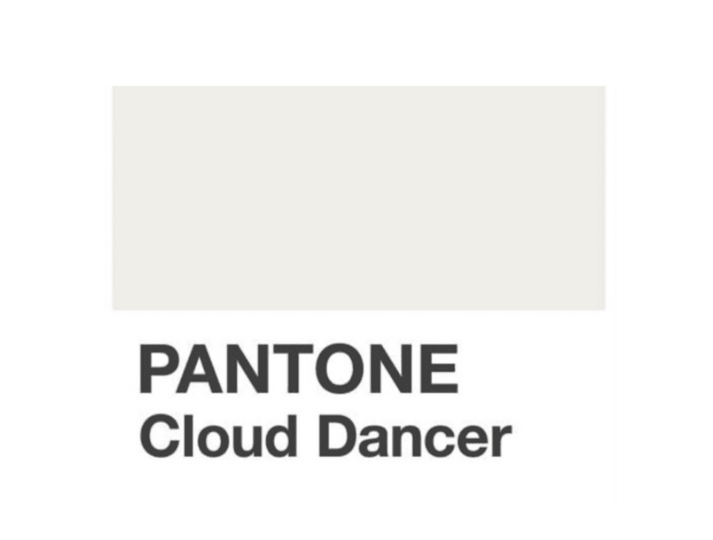
Pantone 2025 Cloud Dancer: Why This Color Triggers Boycott and Controversy
Cloud Dancer: When Pantone Chooses Silence
The color of quiet luxury or a symptom of an era in crisis? When Pantone unveils PANTONE 15-4201 Cloud Dancer as the color of the year 2025, interpretations diverge. On one side, interior design magazines see the consecration of discreet refinement, the apex of luxury that whispers. On the other, sociologists read collective anxiety, the chromatic withdrawal of an exhausted society. An off-white, barely tinted with pearl gray, so subtle it seems on the verge of disappearing… but what does it really say about us?
Leatrice Eiseman, executive director of the Pantone Color Institute, chooses her words: “Cloud Dancer represents a necessary breath.” But a breath from what, exactly? From aesthetic overload or from the collapse of certainties? The question deserves attention, because behind this almost imperceptible shade, much more than a simple decorative choice is at stake.
The Silent Luxury Hypothesis
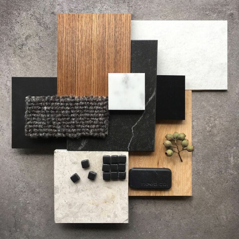
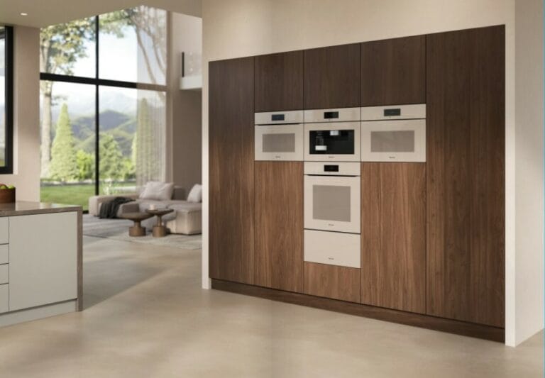
The Milanese showrooms of the last Salone del Mobile don’t lie. Cloud Dancer lines the walls of the most expensive installations, those where Patricia Urquiola presents eight-thousand-euro sofas, where Piero Lissoni unveils lighting fixtures sculpted from alabaster. This vaporous neutrality becomes the perfect setting for precious objects, like those museum display cases lined with gray silk that magnify the artifacts they contain.
Quiet luxury, this trend born in the wardrobes of the New York elite before contaminating all design sectors, would find in Cloud Dancer its ideal chromatic expression. Gone is the garish gold of the 2000s, the screaming logos, the ostentatious Venetian marbles. The new code of wealth is written in imperceptible nuances, in subtleties that only insiders can decode. A Cloud Dancer wall in a Tribeca loft signals: “I have nothing to prove.”
Industry figures confirm this. Farrow & Ball reports a 180% increase in sales of “complex whites” since 2020. Little Greene is developing six new shades gravitating around this vaporous gray-white. These paints cost three to four times the price of a standard white, but their buyers are seeking precisely this indefinable quality, this refinement that doesn’t shout.
The Existential Crisis Hypothesis
Yet, let’s look at the other side. Cloud Dancer emerges in a context of polycrises: climate, economic, geopolitical, health-related. The shades we choose to dress our spaces reflect our collective states of mind. The Viva Magenta red of 2023 still celebrated a certain vitality. Cloud Dancer, two years later, seems to have lost all chromatic energy.
“It’s the color of aesthetic exhaustion,” analyzes Sophie Fetro, design sociologist at the École des Beaux-Arts de Paris. “After decades of visual hyperstimulation, decorative maximalism, colorful fast-design, Cloud Dancer signals a form of capitulation. We no longer choose, we retreat into the neutral.” This reading finds echo in the rise of anxious minimalism, those interiors emptied of all personality, those sanitized spaces that resemble waiting rooms more than living spaces.
Social media amplifies the phenomenon. On Instagram, the “clean” aesthetic – these monochromatic grids where everything is white, beige, pale gray – accumulates billions of views. But behind the quest for visual perfection often hides the anxiety of control, the need to master at least one’s immediate environment when the outside world seems to escape all logic.
Cloud Dancer then becomes the symptom of a society laying down its chromatic arms, taking refuge in the absence of decision. Neither warm nor cold, neither colored nor pure white. A shade that doesn’t take sides, doesn’t commit, that floats in an anesthetized comfort zone.
White and Its Ideological Ghosts
But a third reading, darker, emerges on social media and in certain critical circles. Could total white, immaculate and sanitized, have become the visual language of a certain ideological violence? The accusation circulates: this “all white” aesthetic would carry within it a form of exclusionary purism, even aesthetic fascism. A debate that color historian Michel Pastoureau would undoubtedly have found both fascinating and necessary.
The history of colors teaches us a fundamental truth: no shade is intrinsically meaningful. White has been in turn the color of mourning in Asia, a symbol of purity in medieval Christianity, a revolutionary marker under the French monarchy, a universal flag of surrender. Mussolini’s black shirts coexisted with the Ku Klux Klan’s white tunics. Proof that it’s the context, never the color alone, that creates the symbol.
The contemporary debate feeds on a confusion between aesthetics and ideology. When modernist architecture imposes its white volumes in the 1920s-1930s, it certainly conveys a hygienist, rationalist, universalist societal project. Le Corbusier dreams of immaculate “machines for living” that would erase class distinctions. This white utopia would be appropriated by all regimes: Scandinavian democracies as well as fascist Italy, the German Bauhaus as well as Soviet housing projects.
Today, the criticism targets something else. These “all white” interiors proliferating on Pinterest and Instagram would be the expression of a privilege: that of being able to maintain immaculate whiteness, of living in spaces where real life (its traces, its disorders, its mixed colors) would have no place. White as a negation of the living, as a fantasy of total control. The argument deserves consideration.
When the Internet Turns on Pantone
The theoretical controversy quickly transformed into a digital storm. On Twitter, TikTok, and Instagram, the announcement of Cloud Dancer triggered a wave of sarcasm, memes, and boycott calls. “Pantone chose the color of nothingness,” “Not even a color, just the absence of courage,” “It’s official: 2025 will be boring.” The hashtags #BoycottPantone and #NotMyColor accumulated millions of views in just a few hours.
Some internet users went further, outright calling to “fire Pantone” from their creative vocabulary. Independent designers launched their own alternative “colors of the year” – an electric purple baptized “Rebel Velvet,” a burnt orange named “Burn the Beige,” an acidic green nicknamed “Fuck Neutrality.” The message was clear: Cloud Dancer represented everything they rejected. Lukewarmness, conformism, creative resignation.
The scale of the reaction is surprising. Never before had a Pantone color provoked such visceral rejection. Even Greenery in 2017, judged too “Kermit the Frog” by some, or Ultra Violet in 2018, accused of being kitsch, hadn’t provoked boycott calls. Cloud Dancer clearly touches a sensitive nerve: that of weariness with trends deemed sanitized, disconnected, imposed by an institution perceived as elitist.
The generational dimension appears clearly. On TikTok, where Gen Z dominates, videos mocking Cloud Dancer explode. A content creator publishes a parody where she paints her room in Cloud Dancer then instantly falls asleep from boredom (3.2 million views). Another compares the shade to “life’s loading screen” (1.8 million likes). Creative youth seems to massively reject what it perceives as the aesthetic capitulation of previous generations.
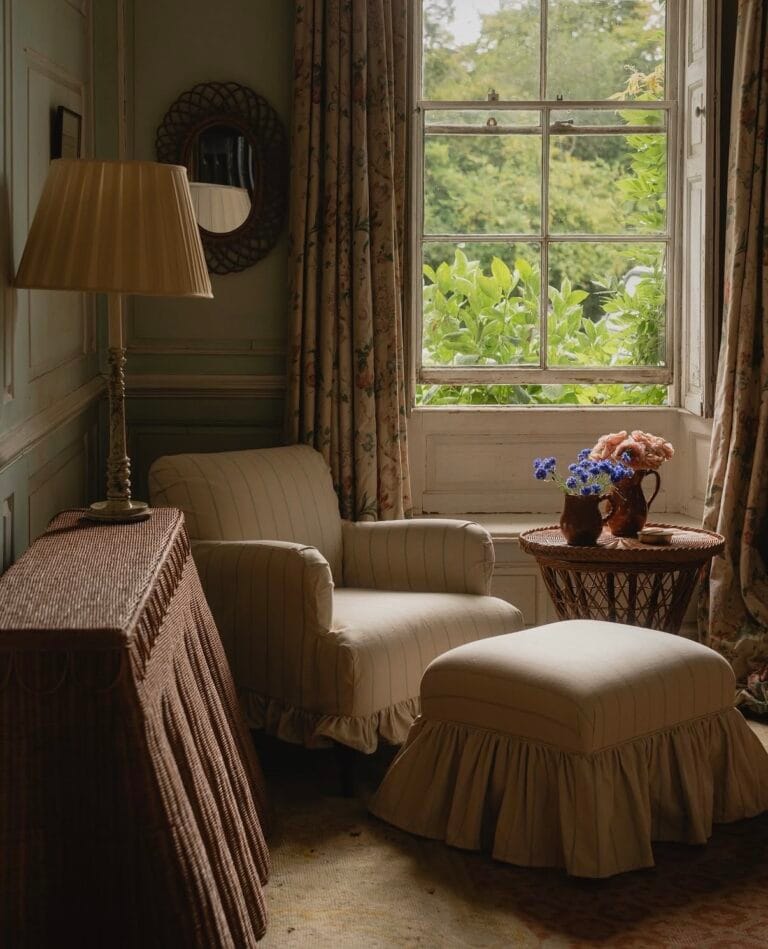
Yet, the history of white in design reveals an entirely different complexity. In Japan, the white of washi paper or raku ceramics celebrates impermanence. Each stain becomes memory, each patina adds beauty. In the Greek Cyclades, whitewashed lime houses breathe, are redone each year, testify to a living relationship with matter. The Scandinavian white of the 1950s – that of Alvar Aalto and Arne Jacobsen – sought to maximize rare light, not to impose dogmatic purity.
Cloud Dancer, precisely, escapes absolute white. This nuanced, imperfect, living gray-white rejects the fantasy of total purity. It accepts variations, imperfections, nuances. Everything that makes a white space inhabitable rather than exhibited. Where Pantone’s optical white 11-0601 screams its absolute neutrality, Cloud Dancer whispers its humanity. But this subtlety is lost in the digital noise.
The Materiality of Ambivalence
Interior architects navigate between these multiple readings. In Tokyo, Kenya Hara, artistic director of Muji, sees in these shades the continuation of a millennial Japanese philosophy: “ma,” that empty space that gives meaning to fullness. “Cloud Dancer is neither luxury nor crisis nor ideology,” he explains. “It’s a color of the in-between, of the threshold, of transition. It refuses absolutes, that’s its strength.”
Ceramicists confirm this complexity. Working with an off-white requires more technical mastery than a pure white or a bold color. The nuances of Cloud Dancer reveal the imperfections of matter, variations in firing, the happy accidents of glaze. This shade hides nothing, it exposes the truth of materials in all their imperfection. Impossible to project a fantasy of total purity onto it.
In textiles, same observation. Belgian linen marvelously captures these natural gray-whites precisely because the fiber refuses uniformity. Each batch varies slightly, each piece carries its irregularities. Cloud Dancer celebrates this imperfect authenticity, far from icy luxury as well as morose resignation, far also from all ideological purism.
Beyond Binary Oppositions
So, quiet luxury, crisis color, symptom of a worrying purism, or simple target of digital rage? The real answer refuses these simplistic labels. The history of colors teaches us: wanting to fix a single meaning to a shade is an illusion, or manipulation.
Cloud Dancer doesn’t signal the discreet triumph of elites, any more than it confirms the collapse of our chromatic imagination or the return of some fascistic aesthetic. It deserves neither the honors of silent luxury nor the harassment of social media. It simply testifies to a maturity that understands that sophistication sometimes arises from withdrawal rather than assertion. That the richness of a space is measured by the quality of its light more than by the accumulation of its ornaments.
What makes Cloud Dancer interesting is precisely its refusal of purity. This nuanced gray-white accepts life, traces, variations. It is neither the clinical white of totalitarian utopias, nor the lukewarm beige of resignation, nor the optical white of the immaculate page one dares not soil. It’s a white that has already lived, that carries within it the memory of color and the acceptance of imperfection.
That millions of internet users are calling to boycott Pantone mainly reveals our complex relationship with aesthetic authority. Who decides what is beautiful? Who imposes trends? In a world where everyone can be a content creator, the very idea of a “color of the year” chosen by an institution seems obsolete to many. Cloud Dancer then becomes the pretext for a broader revolt against traditional taste prescribers.
History also reminds us that demonizing a color, or rejecting it by simple reflex, amounts to giving it a power it doesn’t have. White is neither innocent nor guilty, neither boring nor revolutionary. It is what we make of it. The white walls of Le Corbusier’s Villa Savoye dialogue with the landscape. Those of a contemporary Apple Store sell desire. Those of an art gallery erase to better reveal. Same shade, radically different uses.
2025 may dance in Cloud Dancer, or not. But this dance is neither a waltz of the privileged, nor a funeral march, nor a worrying parade, nor a submission to Pantone. It’s simply an invitation to rediscover the pleasure of almost nothing, without guilt, without angelism, without paranoia, without rage either. A color that reminds us that beauty exists in nuances, not in certainties. That between all the absolutes one would want it to carry and all the hashtags one would want to stick on it, it remains what it is: a shade, imperfect and alive, open to all possibilities. Take it or leave it.

Digital entrepreneur and craft artisan.
My work bridges craftsmanship, design history and contemporary creation, shaping a personal vision of luxury interior design.
Since 2012, I have been based in my workshop on the shores of Lake Annecy, creating bespoke interiors for architects, decorators and private clients.