

Summer 2026 Colour Trends: Palettes from the World’s Best Paint Houses
Looking for colour inspiration for your interior? Every summer rests on its own chromatic grammar, a combination of shades that runs through fabric collections, furniture editors and decorators’ palettes. Summer 2026 is no exception: after several seasons dominated by minimalist beiges and botanical greens, the colour vocabulary is reshaping itself around stronger contrasts, luminous materials and a certain solar nostalgia. These new colours can be introduced in many way,ms through paint, textiles and wall coverings.
Discover the palettes and atmospheres shaping interiors this season with Hart Design Selection.
Summer 2026 palettes: what’s changing
The major trend forecasters (Pantone, WGSN, NCS Colour) are converging this season towards a more contrasted reading of interior colour. The neutrality of the post-pandemic years is giving way to more decisive combinations, without tipping into chromatic excess. The balance sought: one strong anchor shade, two or three soft supporting tones, and a punctual accent. This three-part structure is becoming the common language of summer 2026 textile and furniture collections.
What distinguishes the 2026 season from those before it: colour is fully embraced, but chosen with method. The great paint houses – from Farrow & Ball to Ressource and Little Greene – have each built their new collections around this tension between chromatic assertion and sophisticated restraint. The result: palettes that read immediately, but are never simplistic.
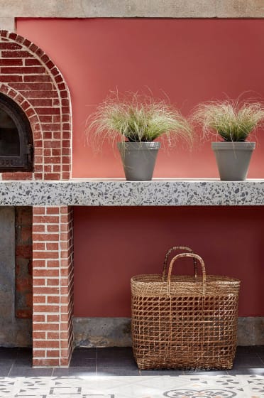
Ochre, terracotta, burnt copper: the solar palette
The terracotta family remains one of the season’s most solid choices not as a repetition of previous years, but with a shift towards warmer, more luminous tones. Golden ochre takes precedence over flat terracotta; burnt copper, almost metallic, punctuates compositions that would have been too tame without it.
This is a palette that tells a story: the Mediterranean, dry earth, summer houses. Little Greene has captured it perfectly with Tuscan Red (140) and Madeleine (338), two ochres of rare pigment richness that change character entirely between morning and evening light. Farrow & Ball offers its version with Red Earth (64), more orange, more solar, ideal on a single feature wall in a south-facing living room.
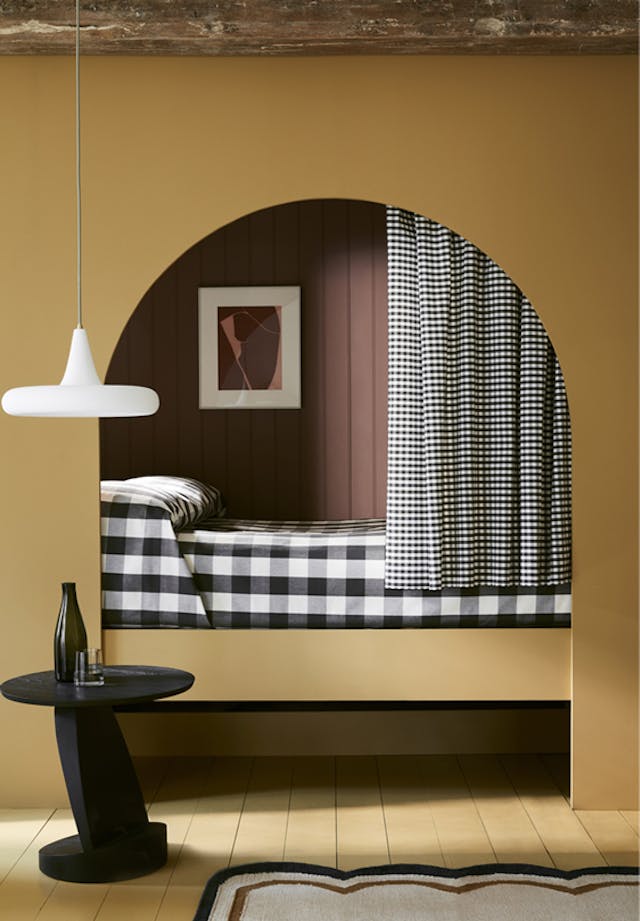
Indoors, this palette works especially well paired with raw natural materials: thick linen, wicker, untreated beech wood.
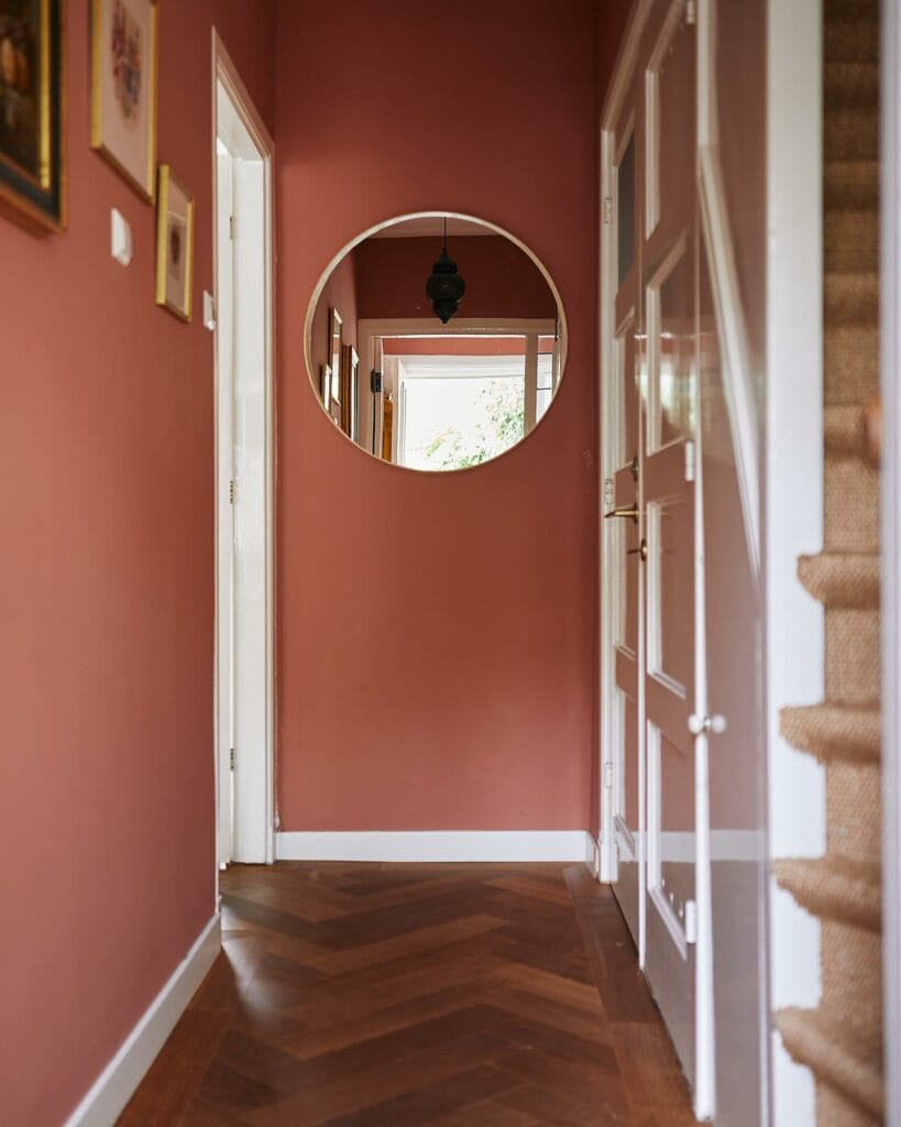
It sits naturally in south-facing living spaces or holiday homes, where it resonates with summer light without overwhelming the eye.
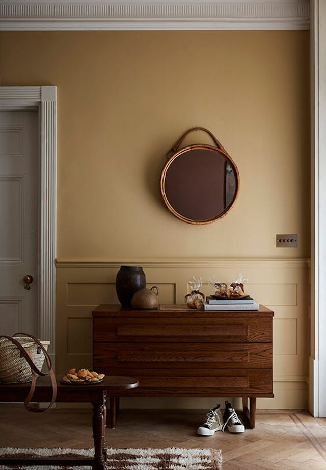
Fabric editors are interpreting these shades in ribbed velvets, woven linen and textured cotton – supports that give depth to flat areas of colour.
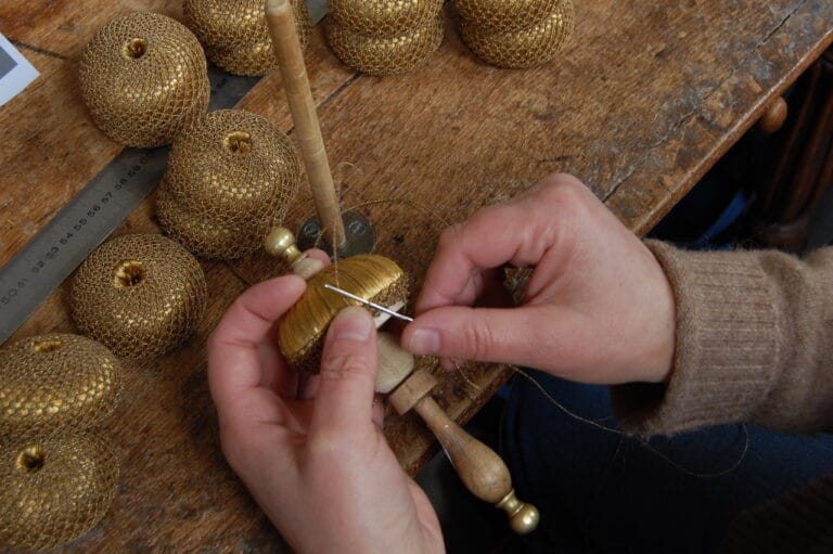
On the trimmings side, braids and gimp are being dyed in the same registers: a copper piping on a natural linen upholstery is enough to anchor a room within this palette without any decorative overload.
Majorelle blue, deep indigo: the deliberate contrast
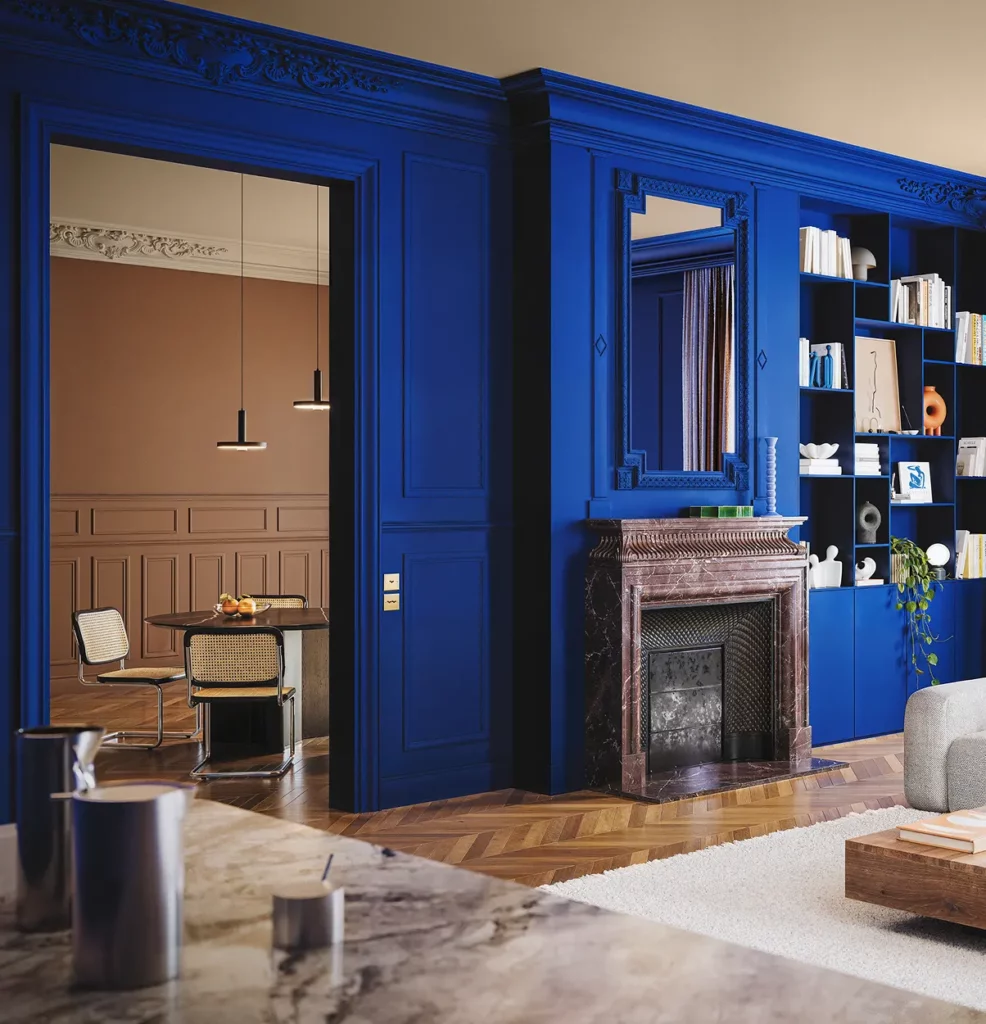
Against the warm shades, summer 2026 stages a dense, saturated blue far from the pastel blues of previous seasons. Majorelle blue, deep indigo, slightly violet midnight blue: these tones assert themselves as accent colours or, more boldly, as the primary shade of an entire space.
This intense blue works in direct contrast with terracottas and ochres, an opposition that recalls Mediterranean and Moroccan palettes, reinterpreted here in a more sober contemporary key. It is one of the season’s most powerful contrasts, and one of the hardest to calibrate. The rule: never in equal proportions. Blue works as a dominant or as an accent, rarely anything in between.
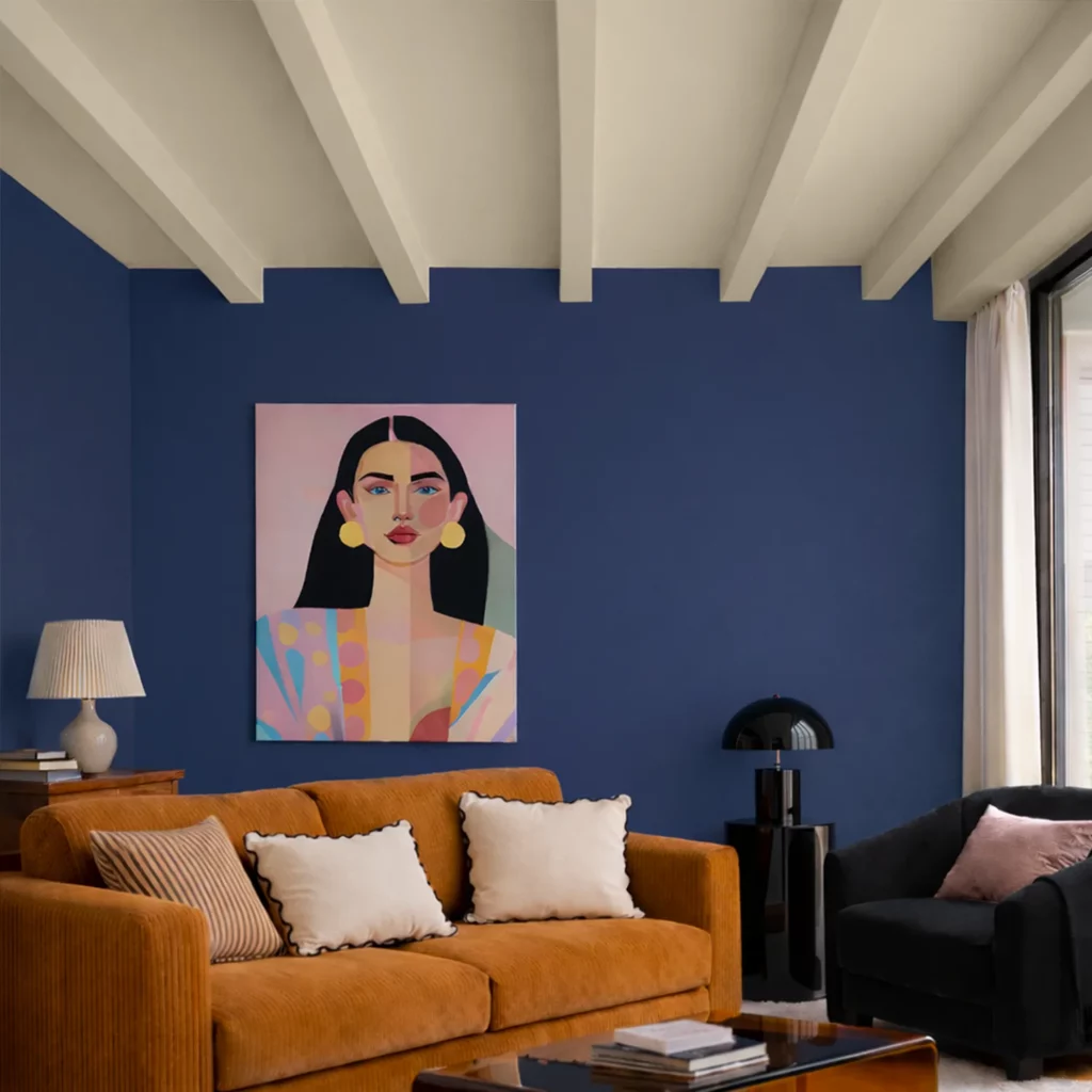
If you are looking for the true Klein blue, it is available from Ressource exclusively – under official licence from the Yves Klein Foundation, in the reference La Fragilité (A6 21.R029). No other paint house can legally reproduce this IKB. It is a shade apart, deserving a space apart.
A fabric wall hanging in indigo damask against a white salon wall, or a sofa upholstered in midnight blue velvet in an ochre-walled room: the combinations are bold, but never aggressive when proportions are respected.
Editors such as Pierre Frey and Dedar are offering this season several velvets and silks in these deep blues, often with iridescent qualities that accentuate the sense of depth depending on the light. Both feature among the essential names in high-end upholstery fabric.
Broken white, chalk, natural linen: the base neutrals
The warm neutrals trend does not fade: it refines itself. Summer 2026 moves away from pure white and generic beige in favour of more complex tones: slightly rosy cream, chalk white with a grey undertone, unbleached natural linen.
These are the hardest shades to get right and the most rewarding when you do. A failed white reads cold and clinical. A well-chosen white shifts with the light, captures the warmth of the setting sun, adapts to every hour of the day. Paint & Paper Library excels here with Plaster V (405), a slightly rosy chalk white of rare sophistication. Little Greene offers Linen Wash (33) and Roman Plaster, two references that feel right in almost any context.
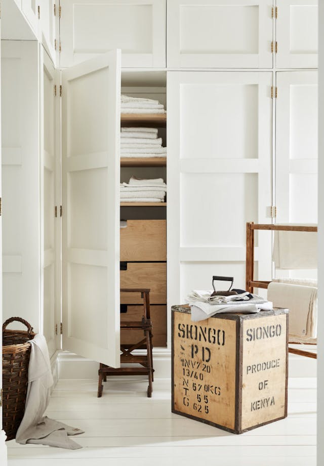
These shades form the base of summer palettes, not by default, but as a deliberate choice of visual breathing room.
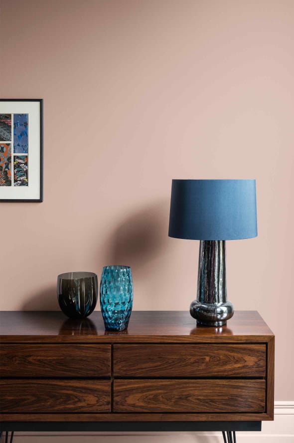
In textile decoration, natural linen asserts itself as the material symbol of this chosen neutrality. Its tonal variations – depending on weave, weight and finish – allow monochromatic spaces of great sophistication to be built. A raw linen wall hanging, a linen seat upholstery, a linen voile curtain: the coherence comes from the material, the subtlety from the value variations.
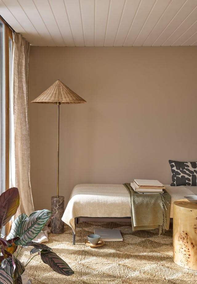
These neutrals pair effortlessly with both palettes above: they allow the chromatic intensity of a room to be calibrated, and strong accents to be balanced without smothering them.
Deep green, moss, soft khaki: nature revisited
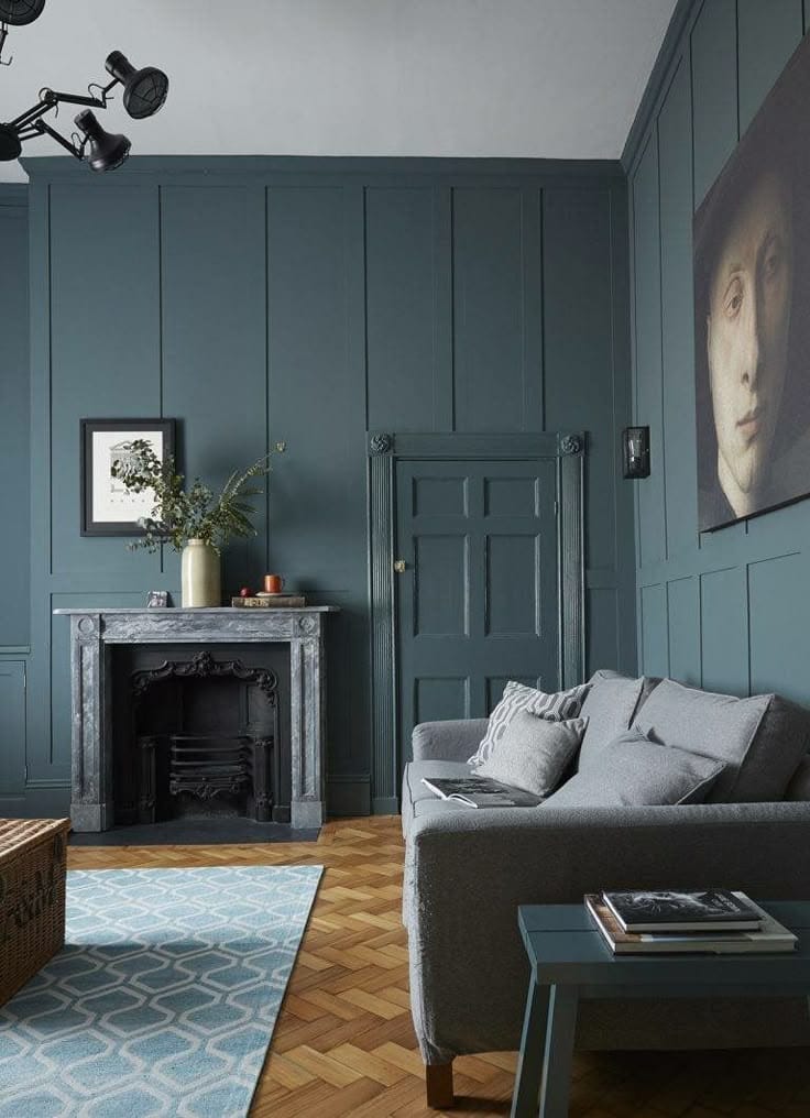
Botanical green is still present, but its nature is changing. The sage green of past seasons is ceding ground to earthier tones: moss green, olive khaki, slightly blue-tinted verdigris. These shades move away from pure botanical reference towards something more urban and mineral.
Farrow & Ball signs two of the season’s most interesting greens: Vert de Douter (318), a deep green tinged with grey that recalls the painted boiseries of Parisian hôtels particuliers, and Reduced Green, softer, almost khaki, equally at home in a library or a bedroom. Paint & Paper Library completes the picture with Midelt Sage (711), a mineral green of remarkable precision, almost blue in the morning light, decidedly green in full daylight.
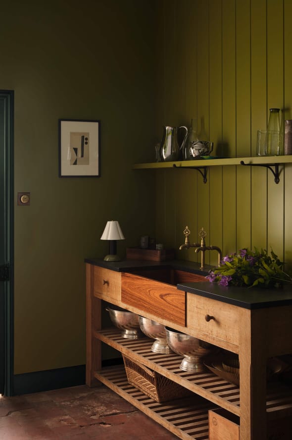
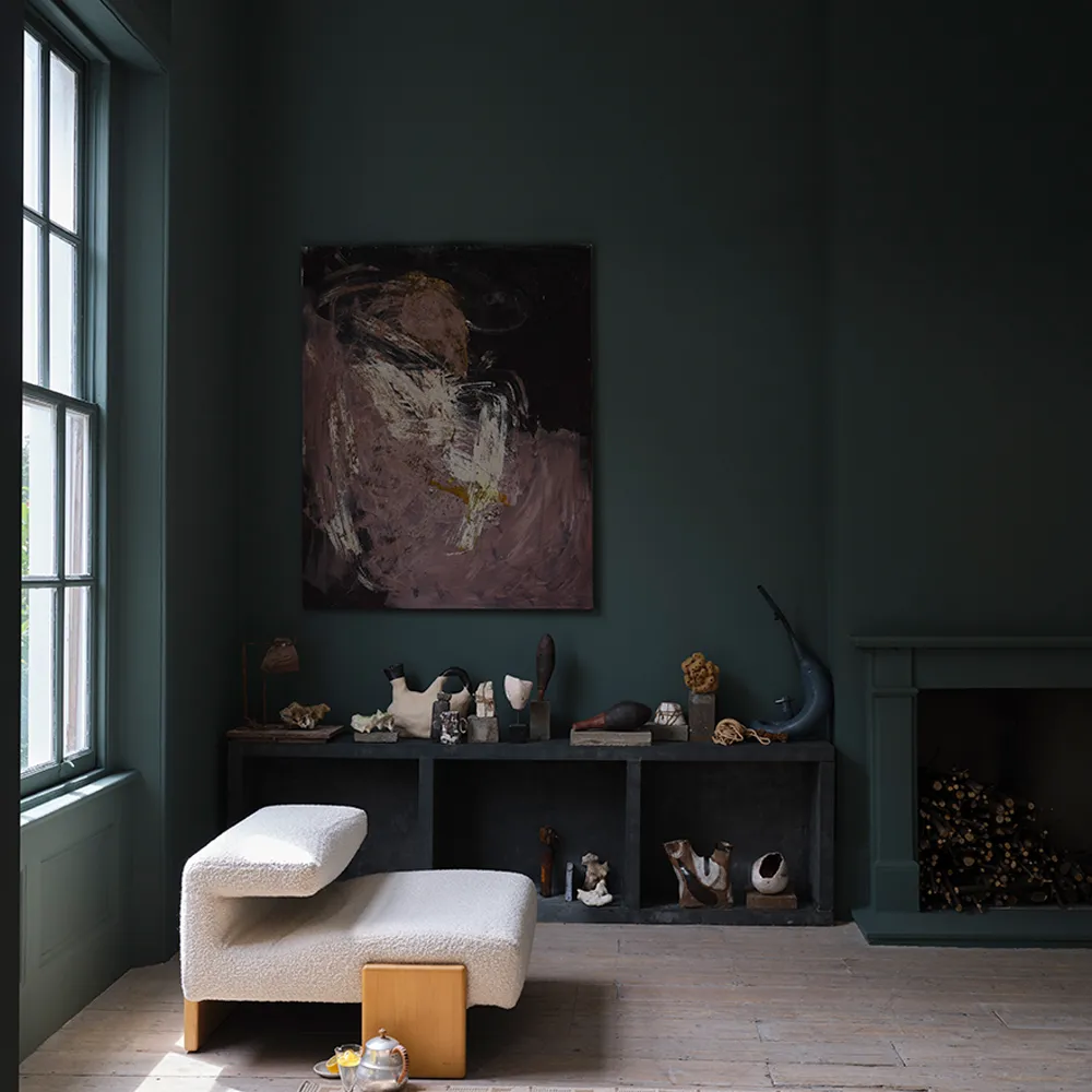
Indoors, these greens work particularly well on walls – in paint or as hangings – because they capture natural light differently at different times of day, creating a living atmosphere without additional furniture.
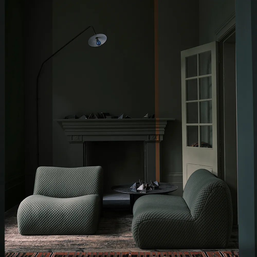
Paired with warm neutrals, they evoke a calming interior landscape; combined with deep blues, they build more structured and sophisticated moods.
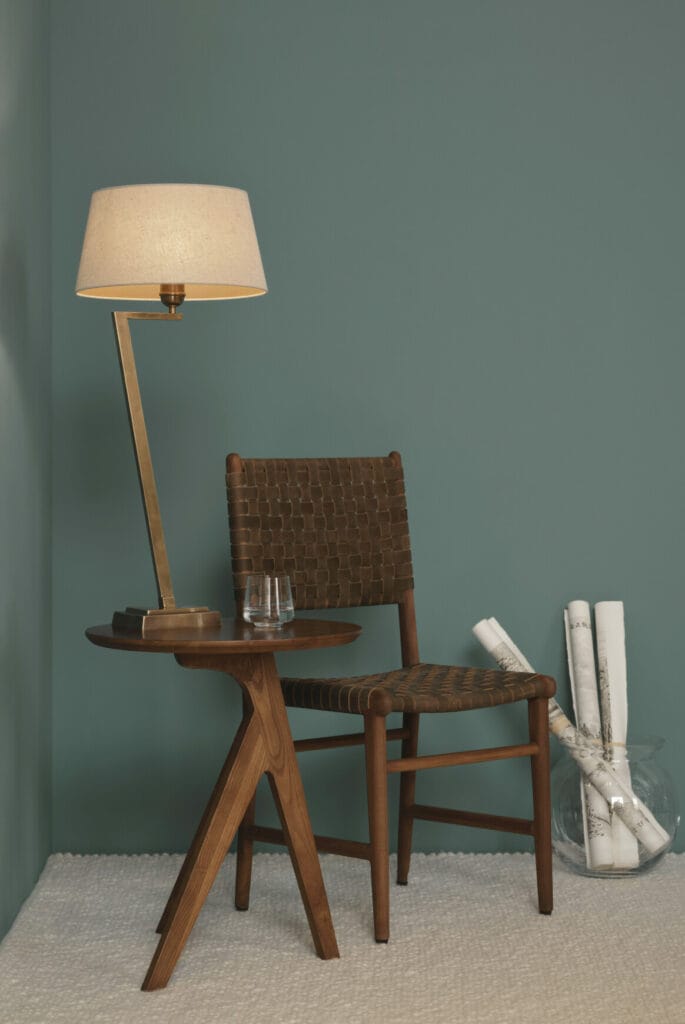
Textile collections this season are interpreting these greens in dyed linen, cotton velvet and jacquard fabric with stylised botanical patterns supports that give colour an essential tactile dimension in interior decoration.
Powder pink, peach, apricot: softness asserted
Less obvious than the previous palettes, the pink-peach-apricot family is nonetheless establishing itself durably in the 2026 collections. This is not the candy pink of passing trends, it is a slightly yellowed powder pink, a soft peach leaning towards cream, a matte apricot that approaches pale terracotta.
Edward Bulmer offers with Jonquil one of the most subtle interpretations of this family, a very soft apricot yellow, formulated from natural pigments, that bathes spaces in an almost golden light without ever reading as gaudy. Paint & Paper Library spans the palette across several registers: Rose Cluster (717) for a mineral pink with a touch of coral, Ruse (323) for an earthier version, Rose Jaipur for more assertive warmth. Three shades, three distinct atmospheres – all within the same chromatic family.
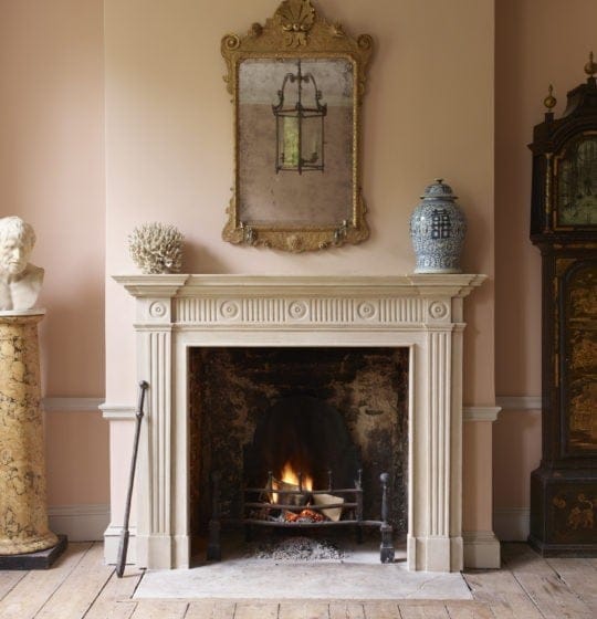
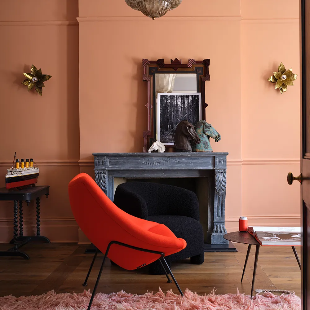
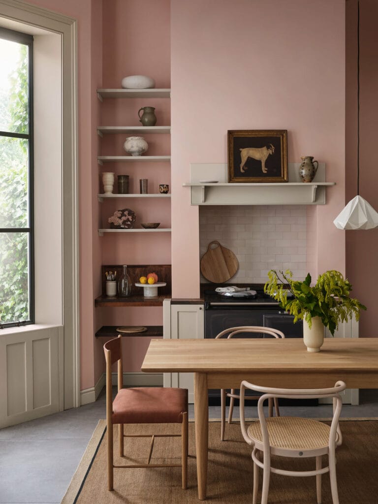
Enveloping shades, flattering under artificial light, particularly suited to bedrooms and intimate spaces.
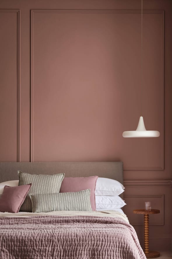
In textiles, this palette also opens interesting possibilities: an armchair upholstered in peach velvet in a chalk white study creates warmth without ostentation. Natural silk trimmings in the same tones – cream, pale apricot, old rose – complete the composition with refined coherence.
How to build your palette from these trends
These trends are not meant to coexist in a single interior, they form a repertoire from which to draw according to the character of each space. A few principles guide the choice.
The three-tone rule. A coherent interior palette generally rests on a dominant shade (60% of surfaces), a secondary shade (30%) and an accent (10%). This structure prevents dispersion and ensures a clear reading of the space.
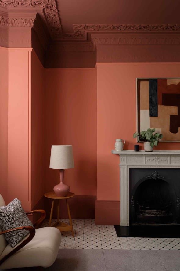
Applied to 2026 trends: a base of warm neutrals in the quiet luxury vein, textile elements in moss green or indigo, an accent in copper or peach.
Natural light as the first filter. A shade chosen from a swatch transforms under natural light — depending on the room’s orientation, ceiling height and time of year. Deep blues absorb light in north-facing spaces; ochres and terracottas intensify in very bright rooms. Always test in situ before committing.
Material as a vehicle for colour. In textile decoration, colour does not exist independently of its support. The same indigo will be matte and absorbing in cotton, luminous and shifting in velvet, transparent and vibrant in silk organza. Choosing a shade simultaneously means choosing the material that will carry it, the two decisions are inseparable.
A season of mastered contrasts
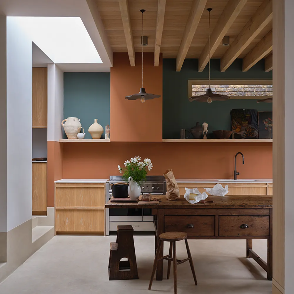
Summer 2026 marks a turning point after several seasons of dominant neutrality. Palettes are asserting themselves, contrasts are being owned, but sophistication remains the guiding thread: this is not colour for colour’s sake, but shades chosen for their capacity to transform the atmosphere of a space, to dialogue with material and light. For decorators and upholsterers, this is a rich season, the one where colour fully reclaims its role as a design tool.
The great prestige paint houses: where to find the season’s shades
The palettes of summer 2026 are not invented on a simulation app: they are chosen on sample, from collections built on decades of pigment expertise. A guide to the key houses and their must-have shades this season.
Farrow & Ball
Founded in 1946 in Dorset, Farrow & Ball remains the most recognisable house on the market. Its signature: high-pigment shades, never blunt, always slightly veiled, which makes them exceptionally responsive to natural light. Season’s shades: Red Earth (64), Inchyra Blue (289), Vert de Douter (318), Reduced Green. farrow-ball.com
Little Greene
Over 200 shades formulated from natural pigments, including a Historical Colours collection documented since the 17th century. An essential reference for restoration projects and characterful interiors. Season’s shades: Tuscan Red (140), Madeleine (338), Bassoon (336), Linen Wash (33), Roman Plaster. littlegreene.com
Ressource
The French reference house for interior design professionals. The most complete range of finishes on the French market: absolute matte, velvet, satin, metallic. The only house authorised to produce the Yves Klein® shade under official licence – reference La Fragilité (A6 21.R029). ressource-peintures.com
Paint & Paper Library
A staple in the projects of the most discerning British and international decorators. Its strength lies in the mastery of muted shades and complex neutrals that are difficult to achieve elsewhere. Season’s shades: Plaster V (405), Midelt Sage (711), Rose Cluster (717), Ruse (323), Rose Jaipur. paintandpaperlibrary.com
Edward Bulmer Natural Paint
All paints formulated from natural pigments, VOC-free. A depth and warmth that synthetic paints cannot match. Season’s shade: Jonquil. A confidential house, championed by the most demanding English decorators. edwardbulmerpaint.co.uk
Mylands
Founded in 1884, the historic supplier to London’s theatres, museums and listed buildings. Over 220 shades, including a particularly refined range of deep tones and blacks. For the season’s dense blues and characterful greens, the Marble & Stone collection is worth close attention. Available by direct order. mylands.com
Flamant
A Belgian house with a Nordic sensibility, specialising in enveloping warm neutrals and broken whites of rare sophistication. For the base neutrals of summer 2026 – rosy cream, linen, chalk – Flamant offers references that are hard to find elsewhere. Available in boutique and online. flamant.com
FAQ: everything you need to know about summer 2026 colour trends
What are the interior colour trends for summer 2026?
Summer 2026 revolves around five chromatic families: warm terracottas and ochres, deep blues and indigos, complex neutrals (chalk white, natural linen), mineral and khaki greens, and the pink-peach-apricot family. These palettes share a common logic: assertive shades, but never saturated – conceived to dialogue with natural light and raw materials.
How do you choose a trend colour without making a mistake?
The first step is understanding the room’s orientation. A deep blue in a north-facing space will absorb light and weigh on the atmosphere; in a south-facing room, it will be beautiful. An ochre intensifies in bright spaces, fades in darker ones. The second step: test the sample in the actual room, at different times of day. All high-end paint houses offer individual samples – a non-negotiable investment before any project.
Is testing a sample always necessary before painting?
Yes, without exception. The shades from prestige collections – whether Farrow & Ball, Ressource or Paint & Paper Library – all have complex pigment compositions that react differently depending on the substrate, finish and ambient light. The same white can read as rosy in one room and grey in another. Painting an A4 patch on the wall and observing it over 48 hours is the bare minimum before committing.
Which finish should you choose for a high-end paint?
Absolute matte is the most flattering finish for complex shades: it absorbs light, enhances pigment depth and conceals wall imperfections. Velvet finish is a good compromise between aesthetics and practicality – slightly washable, it suits living spaces. Satin is reserved for joinery, panelling and damp areas. Avoid it on large wall surfaces: it hardens shades and accentuates substrate defects.
Can dark colours work in a small room?
Yes! And it is often an excellent decision. A small room painted entirely in deep indigo or dark green creates a cocoon effect that works precisely because the space is contained. The mistake to avoid: mixing dark shades with light elements in too great a proportion, which creates an unbalanced contrast. In a small dark room, skirting boards, joinery and ceiling are best treated in the same shade or a very close tone.
Are natural pigment paints really worth the premium?
For high-end projects, yes. Paints formulated from natural pigments – such as those from Edward Bulmer Natural Paint – have a depth and warmth that synthetic paints cannot faithfully replicate. They also age differently: rather than yellowing or fading, they soften over time, particularly visible on earthy shades and ochres. The per-litre premium is real; it is justified in reception rooms and projects where the quality of materials is central to the brief.

Digital entrepreneur and craft artisan.
My work bridges craftsmanship, design history and contemporary creation, shaping a personal vision of luxury interior design.
Since 2012, I have been based in my workshop on the shores of Lake Annecy, creating bespoke interiors for architects, decorators and private clients.